
What We Can Learn From This Year’s Indie Impact Awards Winners
Each winning billboard design offered an exciting way of solving an old problem.
Each out of home execution provided imaginative ways of inspiring clients and consumers alike.
Each winner broke the rectangle and all expectations for what a billboard “should” look like.
Here’s why we think they won. And why we think everyone in billboard design and the out of home industry, as a whole, ought to take notice and push harder.


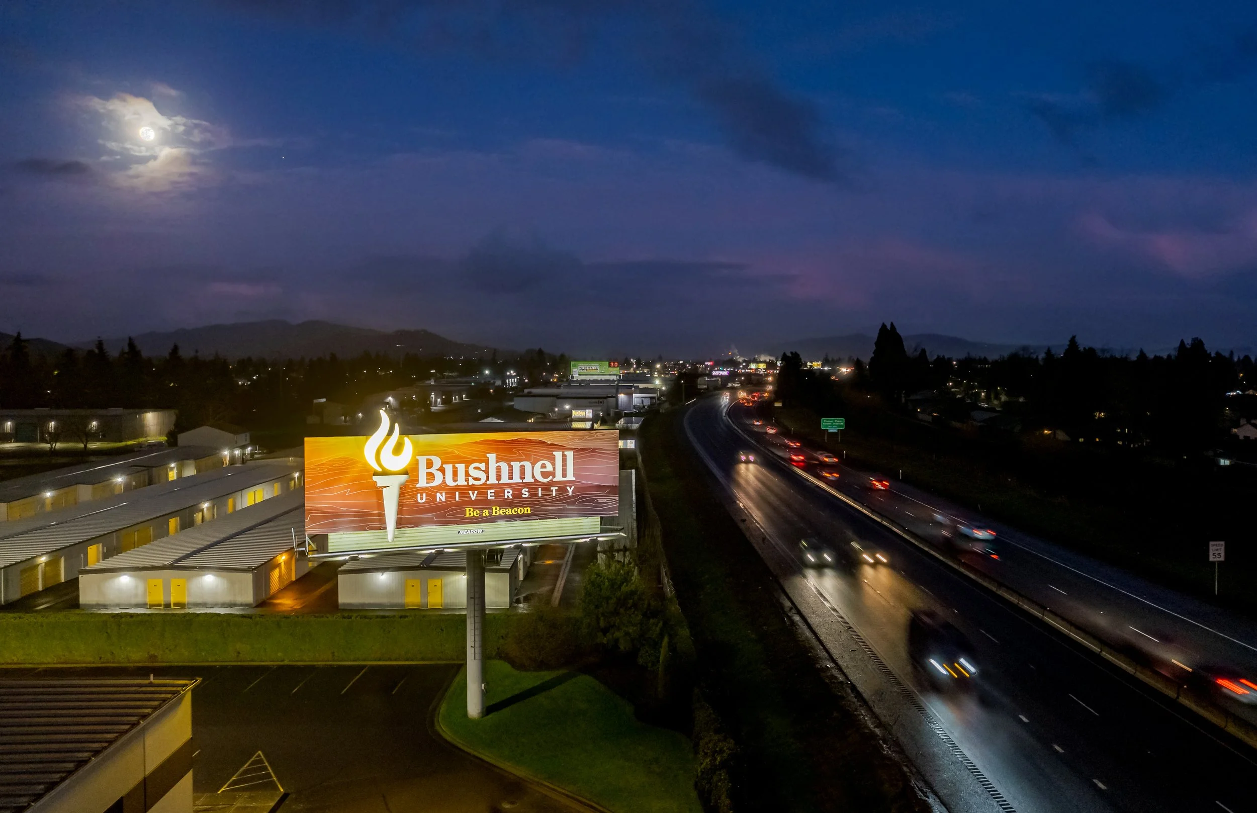
Bushnell University Billboard by Melody Roberts of Out of Home Creative
We didn’t judge this. But we’ve got some good ideas as to why this piece by Melody Roberts resonated so much with the Indie Impact Awards judges. It was an exercise in simplicity and discipline. And in those, this stunning design says only what it must. The subdued topographic map and warm lens flares serve to add texture and depth, while never detracting from the torch or brand name. Instead of leaning into a cheesy headline, we’re given an understated call to action that fits within the brand’s tone.
It’s beautiful execution and judicious use of space and graphic elements is a testament to the working relationship and trust that Melody built with the Bushnell University and Meadow Outdoor teams. A trust, that if not solid, would have prevented such a design from seeing the light of day.


Pure Rock Studios Billboard Campaign by Curtis Jepsen and Travis Hersleff of Reagan Outdoor
How often are you seeing illustrations in billboard campaigns? Let me back up, HOW OFTEN ARE YOU SEEING BILLBOARD CAMPAIGNS at all? That is, multiple designs within the framework of one idea. Sure, there are killer one-shots, one-offs, and statement billboards, but an entire campaign that utilizes imagery, style, and writing tone in service of one rocking concept—that’s turning the volume up to 11. This campaign does what advertising should do and dials it up with an idea and execution that should be commonplace in our industry.
Buuut, as media operators and creative departments working within the industry, we’re far too timid when it comes to campaigns. Many, often taking a single-unit contract in favor of making any kind of sale for short-term gains, when they ought to be going long-term on multiple units. You’re partners in advertising, not space hawkers.

Toby Keith Memorial Billboard by Craig Stevens of Link Media Outdoor
It’s tempting to overload your billboard advertising with too much. Too many words. Too many people. Too many images with too many people. Too many points of contact. All in an effort to subdue your fears. Fears that your customers won’t know how to find you. Or worse yet, they won’t care to, if all of your sh*t isn’t there on the billboard to pick apart. Not Craig Stevens. And not Link Media Outdoor. Hold their beer.
“But, Toby Keith was an icon!” you might say. Or “Everyone knew about ‘Red Solo Cup’!” It only works because his brand, or image already had broad appeal. The hard work of brand-building was done—and it’s easy to follow that train of thought to this conclusion. But it’s misleading. Any business, with any arresting image, in any market could make an indelible impact—like this. Assuming of course, you’ve got a talent like Craig Stevens on your side.
Kingsley Water Damage Services Billboard by Tara Hatley of Grace Outdoor
Do you know why extensions work? Because businesses rarely use them. And to those not in “the know” a billboard extension is the part of the design that extends beyond the standard frame. In this case, the pipe and water deluge. It’s the easiest build of all the billboard embellishments. And it’s a great way to offer real-world depth to any billboard design. Tara Hatley, a 20+year veteran, knows this, and knows how to get the most out of Grace’s billboards for her clients.
On top of the epic nature of the image and extension, the board boasts simplicity. Using only a powerful image and the logo of the brand, these two visuals do all of the heavy-lifting. Allowing your eyes an easy read, and your brain, a sticky memory that you’ll recall when you inevitably experience your own leak.
Pier King Billboard by John Morgan of Whistler Billboards
The title up above “Pier King Billboard” is incorrect. This is not a billboard. It’s an event. It’s a house with a foundation and brick, breaking and quite literally sliding off the catwalk and over the edge. A great billboard advertisement is one that takes advantage of the size and scale of the medium and crashes it down upon our expectations. A great billboard advertisement pushes 2D design into our world. John Morgan, another industry veteran, took what could’ve been just decent and broke it wide open.
You look at this and you can feel the weight of the pieces falling. That’s drama. Amazement. A little anxiety. Awe. Humor. The visual and copy, all working together to make you feel. And when you feel, you remember. And when you remember, action is not far off.
Congratulations to all the winners!
If this awards show taught Todd and me anything, it’s that there is great work being done in places that most don’t expect, promoting clients that most don’t know—in markets that most have never seen. Are your clients and prospects even aware of this level of work? Probably not.
So, I challenge you. Share these awards. If you were lucky enough to attend, you got a booklet showcasing the best in independent out of home. Take it into sales meetings. Set the expectations in your market.
Don’t have a paper copy of the awards booklet, hit us up, we’ll gladly send you a digital copy.
Bigger ad spends start with better creative. And better creative, starts with awareness.
Curious how your billboard ads might do the same?
We’re here for it. We want to be your billboard experts. From creative execution and planning to out of home specific creative and sales training. Let’s get up to something.